What it is
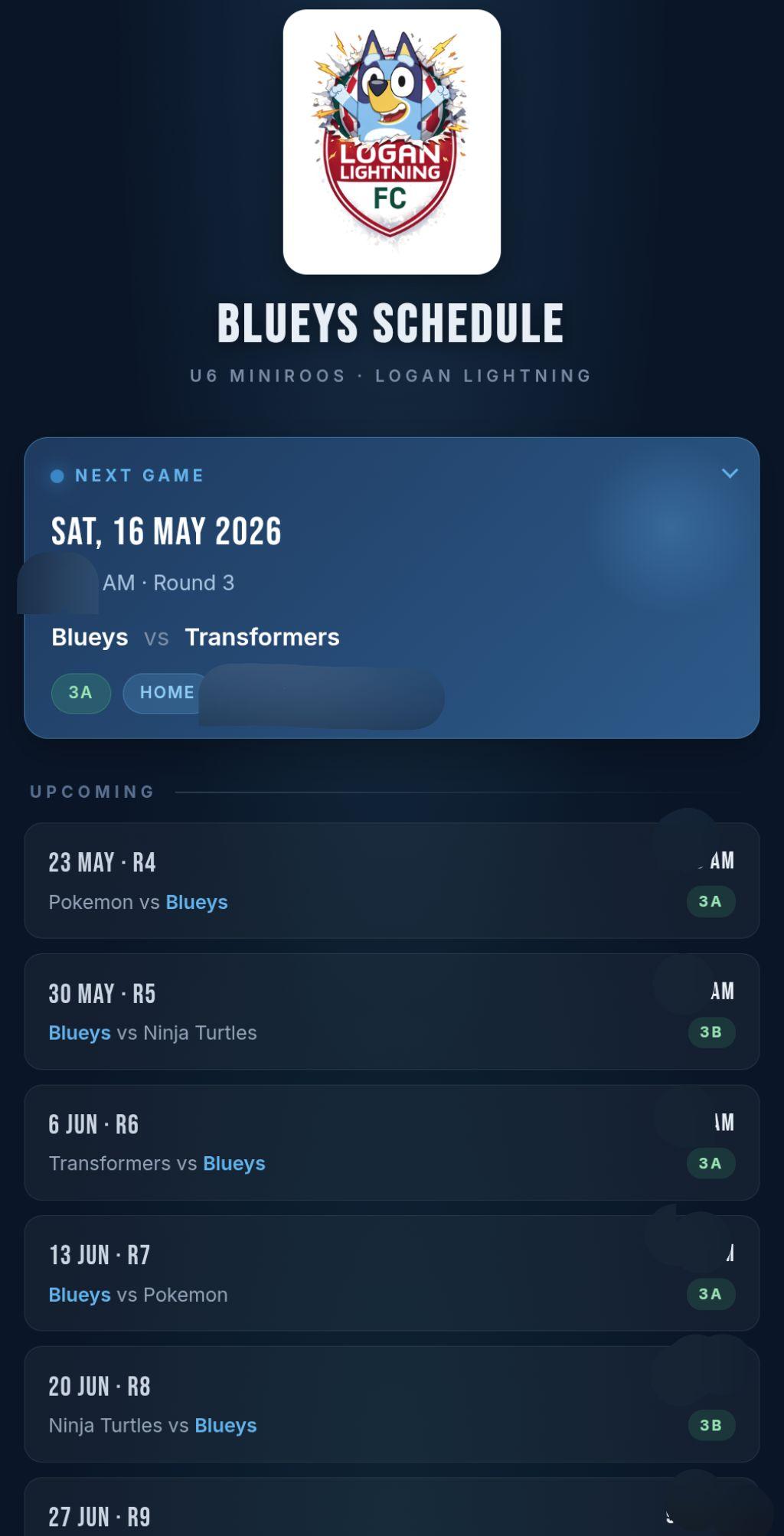
Blueys is a tiny web app for my son's footy team. Match times, locations, opponents, and a few local-knowledge notes about each field. It's deliberately small. One screen, one job.
How it started
The information for the team was scattered across three apps. The schedule lived in the team management app. Other team comms lived in there too. The actual chatter between parents was in WhatsApp. And the field maps kept changing. At one point the fields were labelled with letters, then with numbers, then a different map type entirely.
The deciding moment was driving to a match one day. Someone messaged asking where the field was. The only way to share it was to open the team app, screenshot the map, and send it through. That's fine once. After the second or third time, you start looking for something else.
So I built the something else. Open the app, see what's next, see where it is on the map, see when it starts, see who we're playing. That's it.
Things I found interesting
Just the data I need, none of the rest
All the other tools tried to do everything: squad lists, training plans, payment reminders, sponsor messages. Blueys is the opposite. No login, no settings, no team selector. It's hardcoded to my son's team because that's the only team I care about. If another parent wants it, I just give them the link.
Small touches
Andrew, one of the other team parents and team coach, made the team logo, so the app uses that. The "you are here" pin on the field map has a radar ping animation, which serves no functional purpose but feels nice when you open it. And the field-specific notes are honest. One of them just says "parking gets hectic, arrive early" because that's the kind of thing you'd actually want to know.
Making a web app feel like a phone app
This was the part I learned the most from.
I knew you could add any web page to your home screen on a phone. I also knew it usually saved as a bookmark with the default Android browser icon, which looks rubbish. What I didn't know was how to make it install with a proper app icon, so the bookmark on the home screen looks like a real app.
Turns out it's a few files: a manifest.json that describes the app, plus a set of icon images at the right resolutions. Claude walked me through which file types were needed and helped me generate them.
The first round was close but the icon was a bit small inside its frame. I told Claude what was wrong. We tweaked the sizes and the padding, and now it's pretty perfect. The team logo sits where an Android default icon would have been, and when you tap it the app actually opens like an app instead of like a browser tab.
This was the second time I'd done the PWA-install pattern. The first was the swim coach app, Coach Cavanagh (also in this portfolio). Blueys was the one that made it click. I'll be doing it for every mini-app from here on.
The bigger lesson
If the thing you actually need is one screen of UI and a small JSON file, you can just build that. It takes an evening. And once you know the PWA install pattern, the result feels like a real app on the home screen, not a web shortcut. Specialised beats comprehensive for the things you reach for every weekend.